As the NFL enters a new era following their 100th season, many teams decided to switch up their looks, whether in a modern, or traditional manner.
Being a logo and uniform expert, I decided to grade and analyze all the new looks for the 2020 season.
Make sure to comment your takes below, on whether or not you agree with my grades.
Los Angeles Chargers
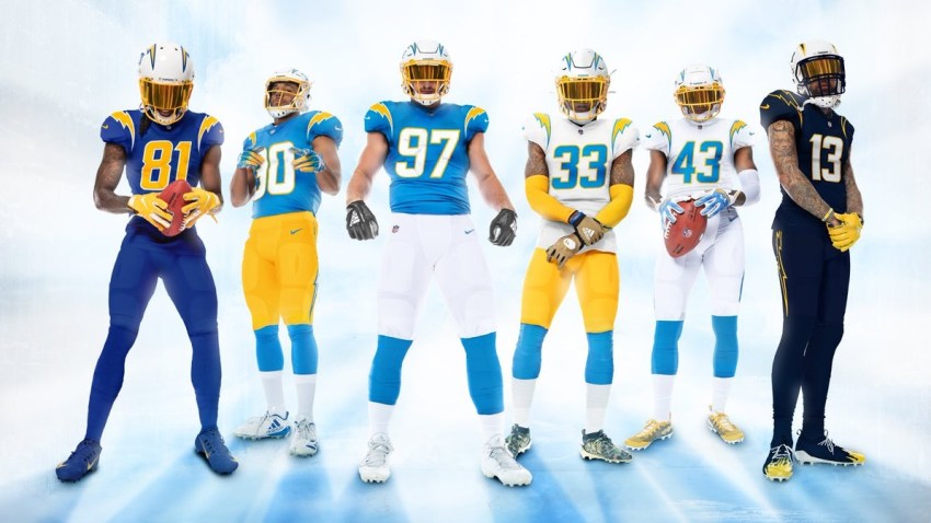
Photo: Los Angeles Chargers
The only thing holding back the Chargers from a better grade was the sizing off the Bolts on the shoulders, and the helmet numbers — which were a bit too big. I also took off some points for not putting a small word-mark logo on the chest, under the NFL logo — as not having it creates a dead space.
But why dwell on the small negatives when there are so many positives.
The best thing the Chargers did was to include ALL color variations. The Chargers have three incredible blues they have showcased over the years (powder, navy, royal), and were smart enough to correctly utilize all three in separate uniforms.
But speaking of colors, making powder blue the primary color was a fantastic decision, as they look beautiful under the California sun.
For those who missed it, the Chargers actually changed their logo, removing the navy blue outline, and keeping it simple with just powder blue and yellow.
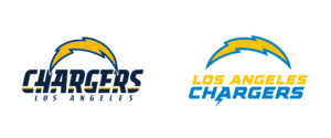
Simplicity always wins.
They were also the one of the first teams in all sports to properly use modernized numbers on a uniform, after countless failed attempts by other teams. They’re slick, and fit the brand.
FINAL GRADE: A
Tampa Bay Buccaneers
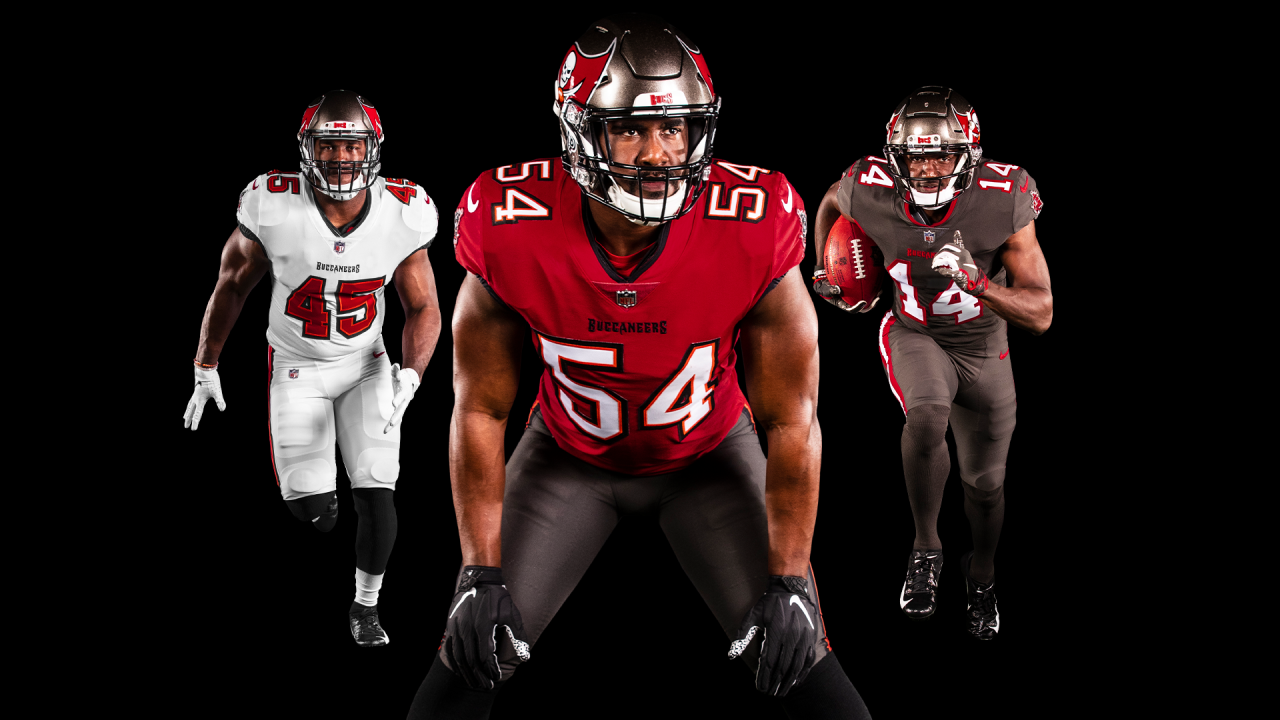
Photo: Tampa Bay Buccaneers
I’m sorry to keep repeating this, but I can’t stress it enough… SIMPLICITY WINS.
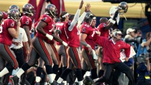
The Bucs had a fantastic bounce back from their terrible modernized uniforms that Nike rolled out after the rebrand, as they returned to a traditional look from the Jon Gruden Super Bowl days.
The crimson red and pewter gray look very clean, and add some much-needed maturity to their look.
The best thing Tampa did was move on from the hideous alarm clock numbers, by upgrading to a traditional block font.
Not including a creamsicle alternate was a huge let down, but maybe we will see one once the NFL changes the awful helmet policy. They did sneak it in the numbers, so I guess that’s a consolation prize.
FINAL GRADE: A-
Cleveland Browns
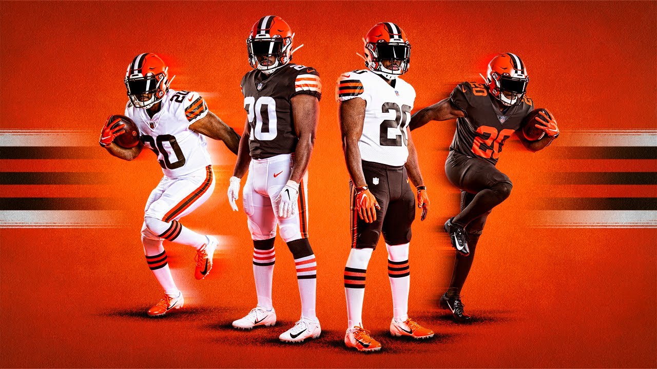
Photo: Cleveland Browns
With a color-scheme of Brown and Orange, it’s not easy to create an attractive uniform for fans outside of Cleveland.
When the Browns re-designed their uniforms after the Nike switch, they certainly had that in mind as they created a modernized look to one of the most traditional brands in sports by adding huge name text everywhere, and 3D numbers.
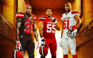
And to everyone’s surprise, modernizing a simple, traditional look was yet another huge failure…
Get the trend here? Modernized uniforms stink almost every time.
Luckily, the Browns recognized their mistake, and brought back the traditional look, and the all-brown color-rush that the fans desired.
My favorite part is that the removal of the extra, unnecessary details gives the Browns a much more mature, professional look; a mindset they need to use just as much on the field for success; as they are a franchise full of childish drama.
Building a look to sell uniforms with brown and orange is not easy, but the Browns realized that taking the simple route was by far the better choice.
FINAL GRADE: B+
New England Patriots: B
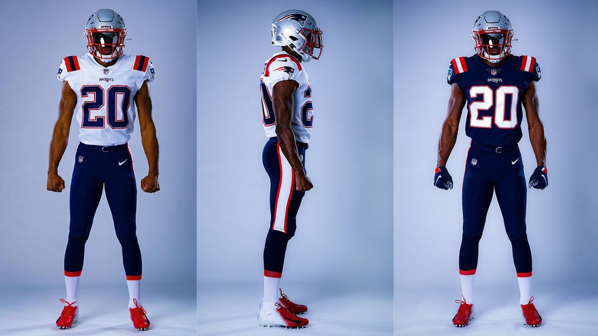
Photo: New England Patriots
Slight change for New England here, as they added the shoulder stripes that were featured on their navy Color Rush uniforms, to the forefront, as well as adding a white base version.
With a brand like the Patriots, it is not worth messing with a bold, crazy look; especially under Kraft and Belichick.
Although, the stripes seem a bit out of place, and always remind me of someone wearing a backpack.
But again, it’s respectable, and nothing outlandish.
FINAL GRADE: B
Atlanta Falcons
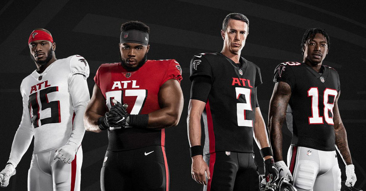
Photo: Atlanta Falcons
Before I start ripping the Falcons’ uniforms, the throwback edition is absolutely beautiful, and should have been the style for all three uniforms… but that wasn’t the case unfortunately.
After every team that modernized their uniform with the Nike switch experienced huge backlash and were prompted to change their uniforms, you’d think that other teams would notice.
Key word “think”, since the Falcons couldn’t get that across their heads, releasing a terrible modern look just to “appeal to Atlantas flashy culture”.
Yes, you should appeal to the younger base to sell uniforms, but you shouldn’t sacrifice your on-field look, for the sake of selling uniforms.
First off, the giant “ATL” is an eye-sore, and they didn’t accomplish “brand-recognition” by putting it there. It puzzles me even more as we see teams get slandered for giant word-marks on their chest.
What’s wrong with putting “ATLANTA” in small letters with an awesome word-mark?
The numbers are massive, and sport a super-modern font, which I don’t like at all… but hey, it’s modern and fun!
Having a lack of pattern and detail around the shoulders was another miss, as if they’re going all-out, that definitely should have been included.
Now for the biggest loser: the gradient uniforms.
I honestly think the Falcons live under a rock, since they literally accomplished to implement every element that is hated by the uniform community.
The gradient alternate looks childish and silly. Not much more to be said.
Atlanta struck out big time. They’ll have new uniforms in 5-or-so years for sure.
FINAL GRADE: D
Los Angeles Rams
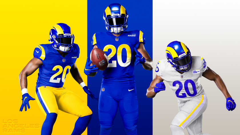
The Rams’ rebrand has been extremely anticipated ever since they moved from St. Louis, as they looked to move on from the “Greatest Show On Turf” navy blue and light gold, and take on the fan-favorite Los Angeles royal blue and sun-gold of the old days.
Before this switch, the Rams completely botched their branding, as they sported a navy blue and white logo, and helmet — from their earliest days — mis-matching it with their St. Louis uniforms; creating a uniform nightmare.
Let alone the fact that for their throwback uniforms that everyone loved, the blue and yellow on their helmets, and uniform did not even match.
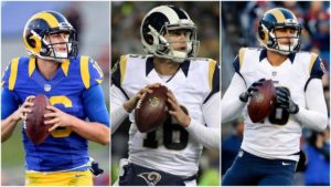
It was a mess, but everyone knew that in the end, the Rams had an incredible brand with their LA gold and blue; so it was virtually impossible for them to roll out a poor uniform!
Boy, were they wrong. The Rams could not have botched this re-brand any worse.
This article is grading the uniforms, but the logos were atrocious, to the point where the Rams had to joke about how bad they were.
People on Twitter were making better logos out of their basements the day of the release, which actually look great:
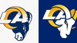
Many thought that they can’t possibly mess up the uniforms as badly, but being the Rams, they found a way to.
Before we get into all the negatives, we do have to give them credit for the helmets, as the modernized horns fit the brand, and are very sleek.
Although, we are not here to praise anything this brass did.
The blue uniform isn’t terrible, as they added modernized, rounded numbers, that include a yellow to white gradient within the number, and the pants stripe. Gradients have drawn much criticism by the uniform community, and the Rams received it.
On the other side, the “bone-white” uniforms were an absolute disaster.
The color was inspired by a ram’s horn, but after further research by some logo experts, that’s not even the color of a Ram’s horn.
Meanwhile, if you look closely, the uniforms aren’t even the same, as the designs are totally different; something you rarely see in sports, but clearly common for the Rams.
The thin yellow stripes are barely visible on the shoulders and pants, and aren’t accompanied by blue.
Last, and certainly least, is the atrocious patches. Not only is it a horribly bland word-mark logo, but the patches don’t even match the uniforms, and include a terrible stitching on the right corner, that was INTENTIONAL. Absolutely unnecessary, and made the uniforms even worse.
The Rams also announced that they are releasing two additional alternate uniforms in the next two years, but the fans should instead be looking forward to the inevitable rebrand in five years when they choose to replace this awful rebrand.
As someone who owns a throwback Rams uniform, and has looked forward to this release for THREE years now even as a Jets fan, this all made me furious.
FINAL GRADE: D
Photo: NFL


