It was an incredible marketing move on behalf of the NHL to bridge the gap between the Stanley Cup Final and the start of the unconventional 2021 season with the release of the “Reverse Retro” series of jerseys. Following the path laid out several years previous with the NBA’s “City Edition” jerseys, the reveal of a compound uniform line has proven to be a more successful strategy for the introduction of alternate uniforms than those used in previous. With the modernization of the league following the shift to Adidas in 2017, it was only a matter of time for something of this nature to come to fruition. However, nothing is perfect, and this jersey series is no exception, so without further ado, here are my personal rankings for the NHL’s Reverse Retro Jerseys:
- New York Islanders
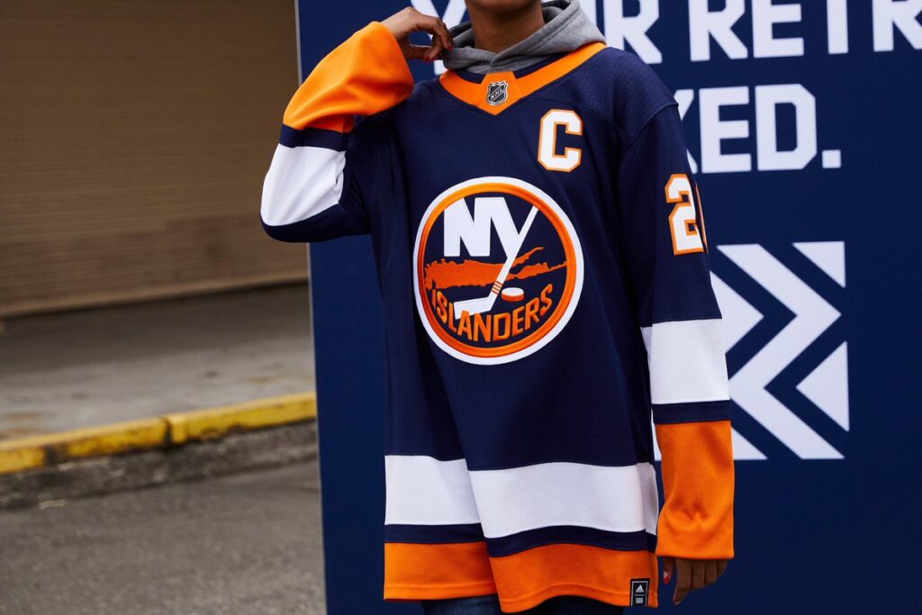
This jersey isn’t bad, per say, it’s just the plainness of it that caused it to fall to the bottom of this list. Compared their regular home uniform, all that was changed was the more royal blue into a navy and the order of the white and orange in the striping. I don’t hate the jersey, in fact, I quite like it, but it’s the lack of creativity that ranks it 31st.
-
Detroit Red Wings
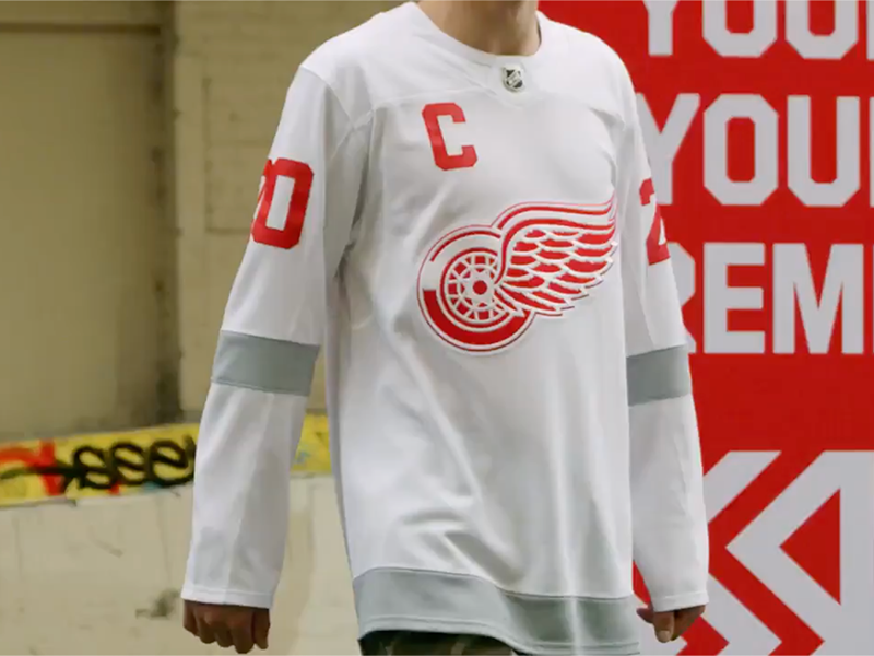
Coming in one spot ahead of their regular season finish, the Red Wings grab the second to last spot on this list. I understand the want to drift away from the typical red and white sweater with this design, but the final product is horrid. The goal was to honor the 98’ cup team with a reverse of their jersey, but Detroit chose to release a glorified practice jersey instead.
-
Dallas Stars
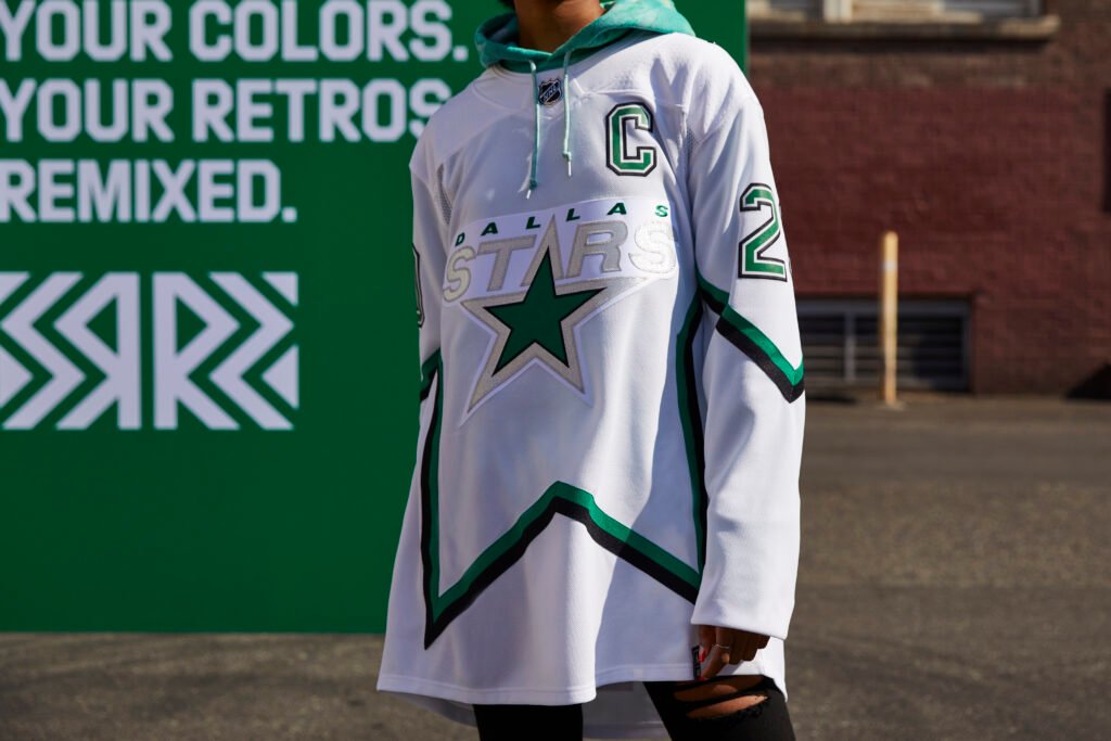
The original version of this uniform is a beautiful creation, so it’s unfortunate that the Stars had to deliver this. The first thing I noticed when I saw this jersey was the odd white border that encapsulates the logo. It gives the appearance of an ironed-on patch. Additionally, there’s just something that’s off with the striping, especially on the back, it makes it appear oddly long, at least from the pictures I’ve seen.
-
Toronto Maple Leafs
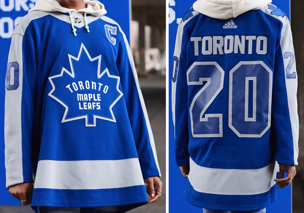
I get the intention behind this jersey, to use the logo the team sported the last time they took home Lord Stanley’s Cup (1967), but there are so many better alternatives to use on a retro jersey than this one. The 63-67 bordered logo would have been a much more appealing choice, or they even could’ve released a white iteration of the Toronto Arenas uniforms, regardless, the route they went was not the best option.
-
New York Rangers
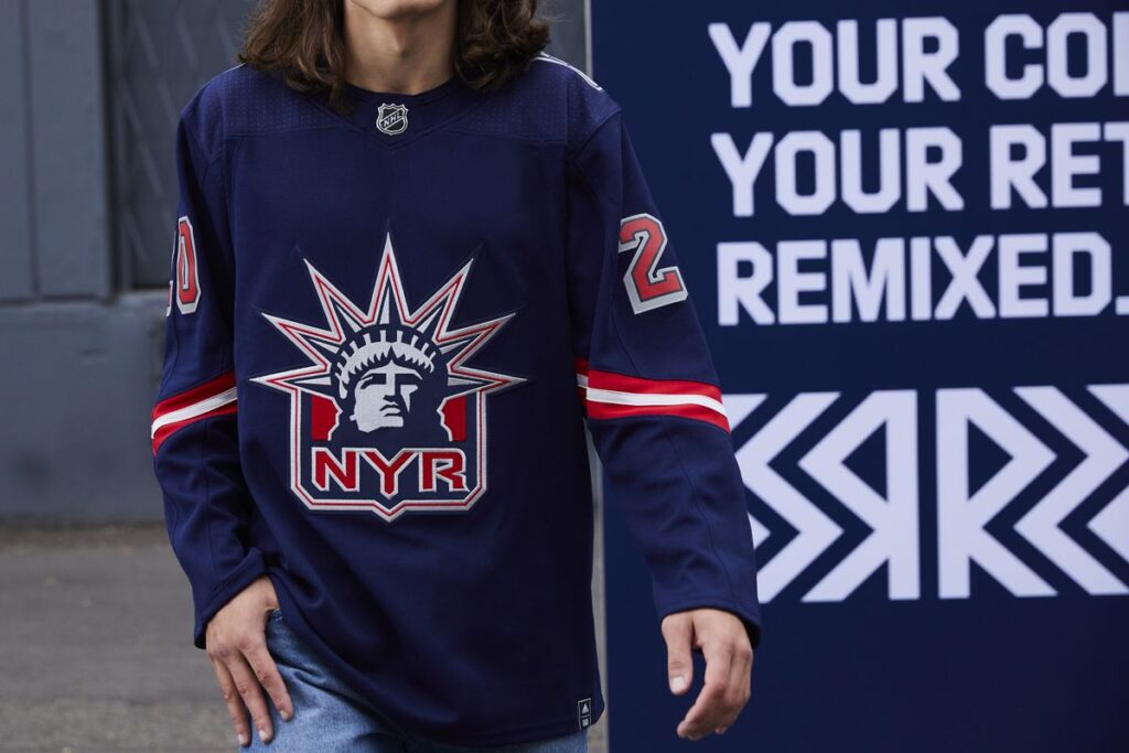
From what I’ve seen online since Monday, there seems to have been a wildly positive response to the Rangers’ new “Liberty” jerseys, I, on the other hand, don’t particularly like them. They look to me like they slapped the Rangers logo on the front of a Patriots color rush jersey and called it a day. The back isn’t bad, but the front is way too bland for my taste.
-
Philadelphia Flyers
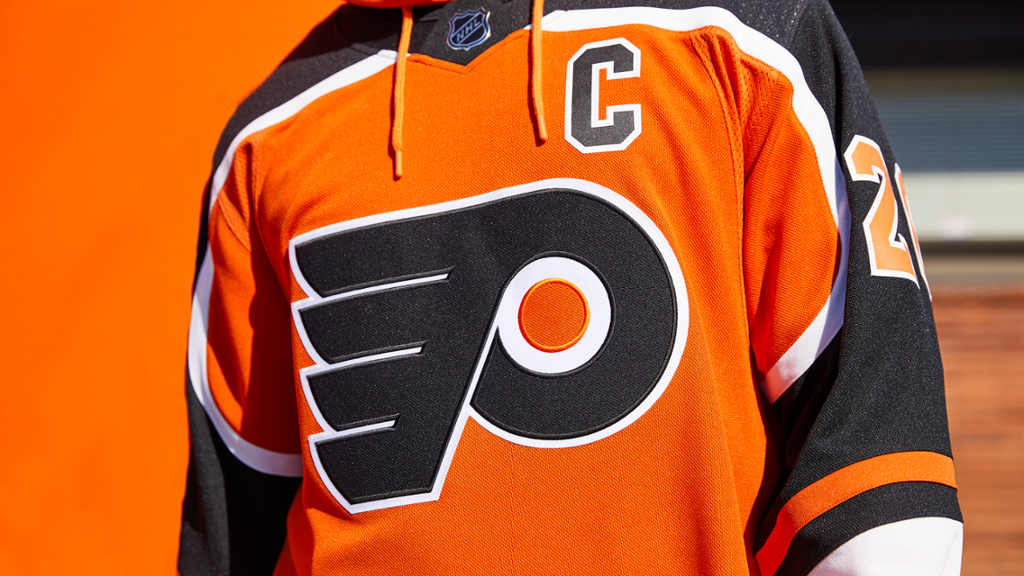
This isn’t an awful jersey by any means, just supremely average. It doesn’t really set itself apart from other Flyers sweaters in any meaningful way, and where it does, with the odd arm striping, it detracts from the uniform more than adds to it, giving it a strange, mushroom like appearance from a head on view.
-
Ottawa Senators
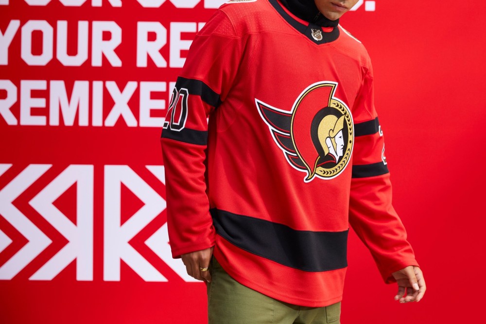
This would’ve been a much cooler jersey if the Sens hadn’t already brought back their original logo from the 90’s as the club’s primary figurehead. Considering that, it’s an incredibly boring uniform that offers nothing to compliment the logo.
-
Vegas Golden Knights
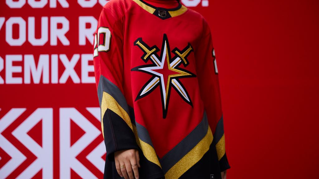
I appreciate the nod to the Las Vegas Thunder that was given with the “v” striping at the bottom of the jersey, that doesn’t make me like it any more though. I love the use of the alternate logo as the main crest, but overall, there’s way too much red for my palate, it’s almost overwhelming.
-
Chicago Blackhawks
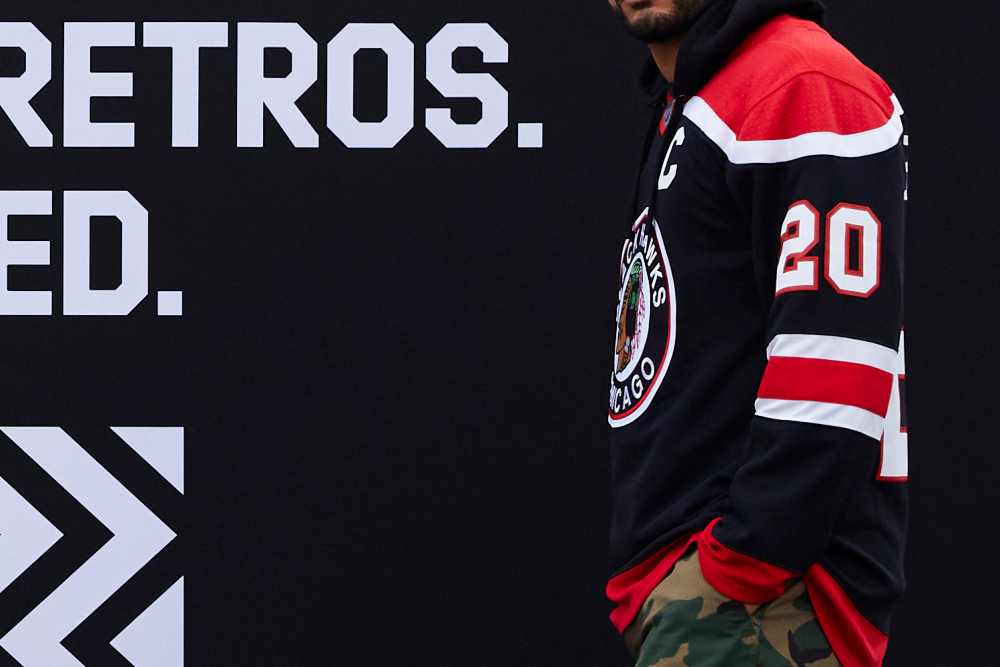
Again, this is just a fairly average uniform. I like the old school logo, and nothing awful really stands out to me about this jersey, but on the flip side, not much positively stands out either. I feel like more could’ve been done here with the length of time the Hawks have existed as a franchise and the number of jerseys they’ve donned.
-
Buffalo Sabres
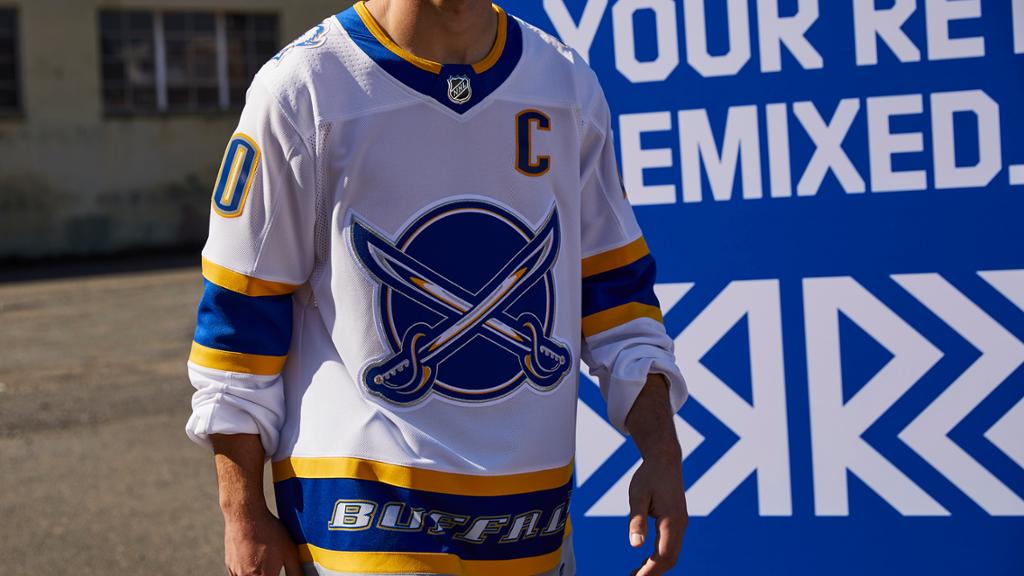
It’s a cool jersey overall, but this is lower than it probably should be on my list because of the wasted potential here. People have been clamoring for a goat head jersey for years and finally there was a prime opportunity to release one, and they stuck the logo on the shoulder. I’m not mad, just disappointed.
-
San Jose Sharks
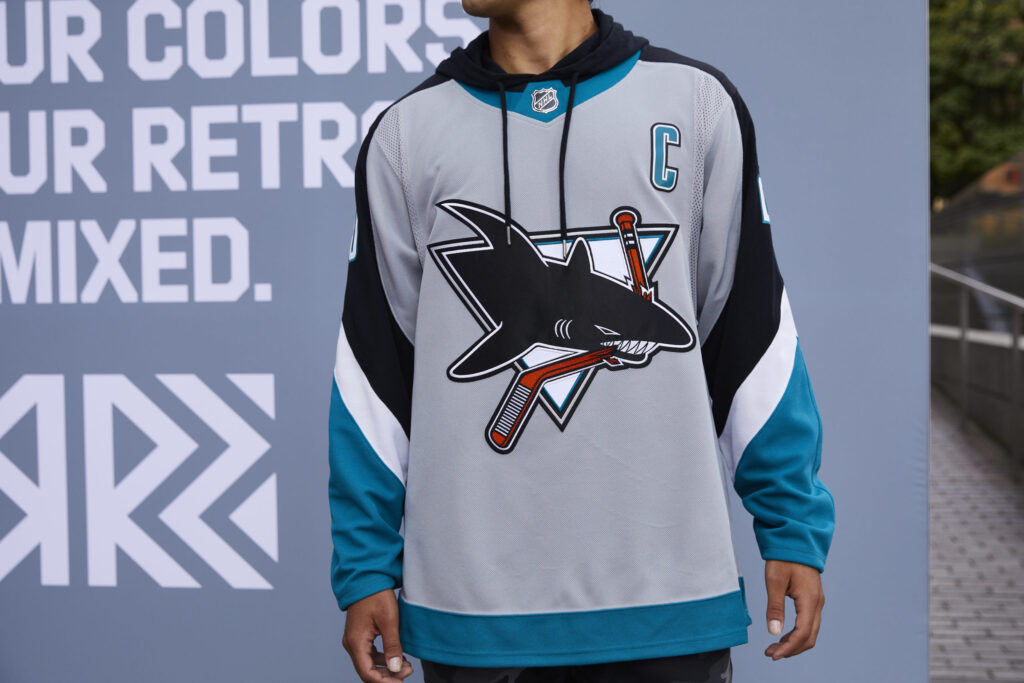
This is honestly one of, if not the best uniform the Sharks have unveiled in the past few years, which isn’t saying a whole lot, but it’s something. I like the grey with the retro logo and the order of the stripes on the sleeves, just not how they went about curving them around. In that regard, they could’ve done better.
-
Nashville Predators
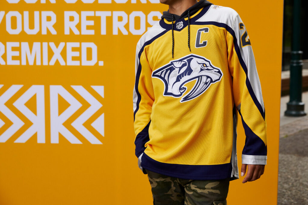
The Predators were able to improve upon their inaugural jerseys with this release, removing the horrific red accents from the center of the logo, but that doesn’t mean they perfected them. The yellow and silver outside sleeve striping works well together, but I’m not exactly sure why they again decided to wrap the stripes around by the sleeves. It might be a little bit of a nit-picky critique, but hey, that’s what this list is for.
-
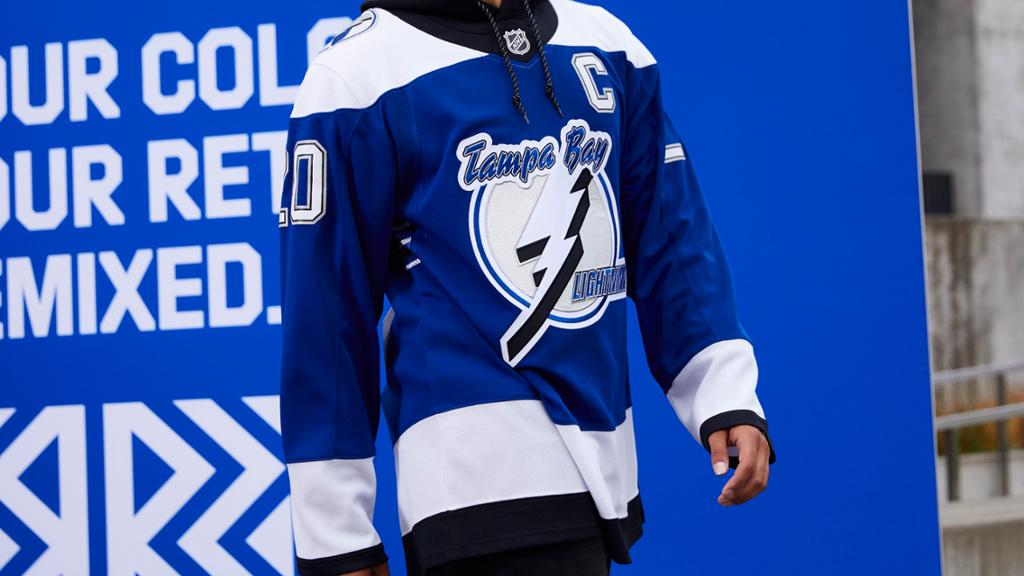
Tampa Bay Lightning
This jersey is a nice classic design, but it certainly isn’t anything to write home about. A mediocre uniform at best. I wish they would’ve used black in a more primary role.
-
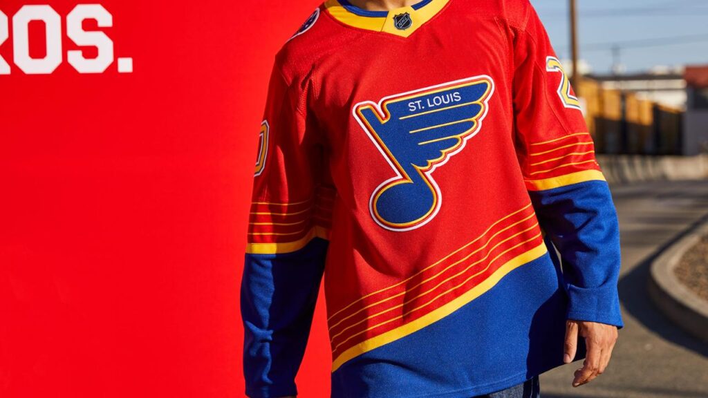
St. Louis Blues
I know people loved this design when the Blues dropped the primary blue jersey as their alternate for last season, and I among them, but in this case, they’ve just taken the lazy route of re-releasing those uniforms with a worse primary color. It was a prime opportunity to be more creative and dig into the franchise history, but they passed on it.
-
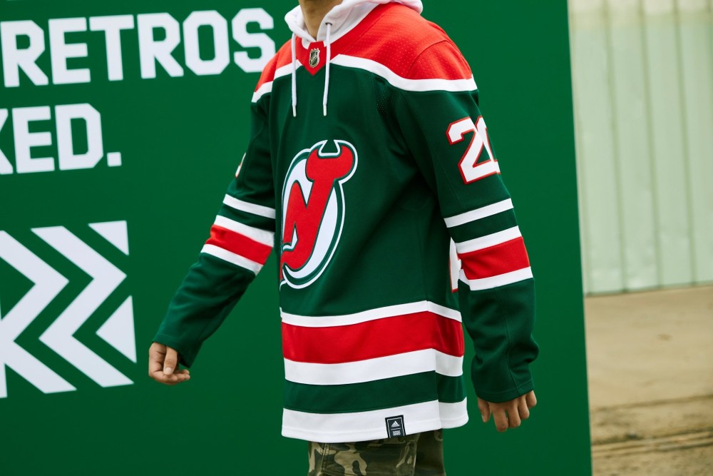
New Jersey Devils
We all knew this would be the jersey the Devils would decide to bring back when the time came, and don’t get me wrong, I do like this design, it’s just the fact that every time I look at it, it screams Christmas, which causes it to fall in these rankings.
-
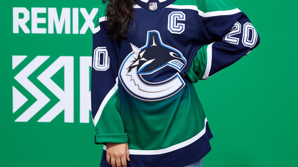
Vancouver Canucks
As much as people seem to hate gradient jerseys, I love the concept. It’s a unique design that isn’t seen often, and it doesn’t look awful unlike some other attempts at originality in this league. The only real gripe I have with this uniform is the fact that they chose to use their current colors and logo rather than bringing back the skate, which, along with looking better, probably would’ve sold better as well.
-
Calgary Flames
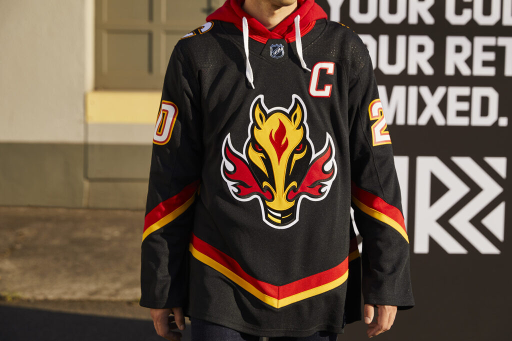
Blasty is back, and it’s better than ever. The two single stripes look much better than the solid red that occupied that space before, a heavy improvement from the controversial jersey’s debut in 1998. At the same time, I half wish they would’ve released a white design instead, considering the name of the series is “reverse retro” and the original was also black. Regardless, still a very clean jersey and one that will round out the top fifteen on this list.
-
Edmonton Oilers
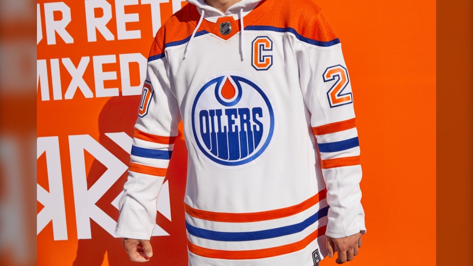
When I look at this jersey, I immediately see that famous image of Wayne Gretzky lifting the cup, and unlike the Devils’ Christmas uniforms, that initial picture isn’t a bad thing. It’s a classic design that is nearly impossible to get wrong, and they didn’t do the impossible here. At some point, I would like to see Edmonton bring back the oil drop logo a major way, this was a chance for that to be brought back, but they chose to go a different route and I’m not mad at the outcome whatsoever.
-
Anaheim Ducks
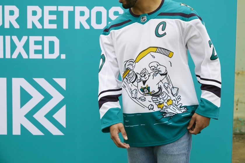
I like the uniqueness of these jerseys, but I’ve never really been that big of a fan of the design itself, so this release does not find its sway into my top ten. I understand the decision to bring these back, but I would’ve much preferred a reverse of their inaugural jerseys or (if they could legally do so) the beautiful green, yellow and purple sweaters from the original movie.
-
Winnipeg Jets
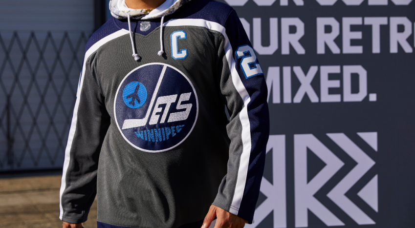
I really like this jersey. The Jets were able to bring back the franchise’s best logo while still incorporating a modern look into the design. The dark color scheme embodies the harshness of a Manitoba winter to a T. the only thing that stops this from being higher up is the arm striping. They should’ve stopped it at the shoulders and horizontal stripes at the elbow rather than continuing the shoulder down the entirety of the arm.
-
Montreal Canadiens
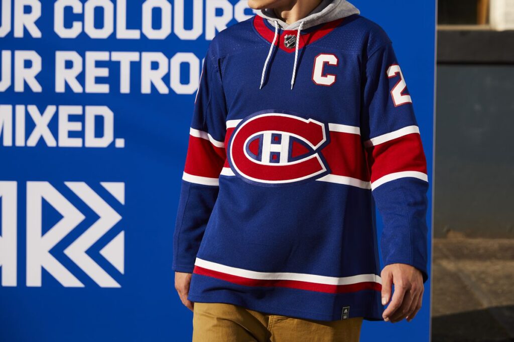
This is a fantastic jersey. Stepping away for once from the primary red and incorporating a contrasting alternate is an incredible decision for the franchise. If they run the jerseys with blue pants and primary blue socks, this has the potential to be one of the best uniform combinations to hit this ice this season.
-
Minnesota Wild
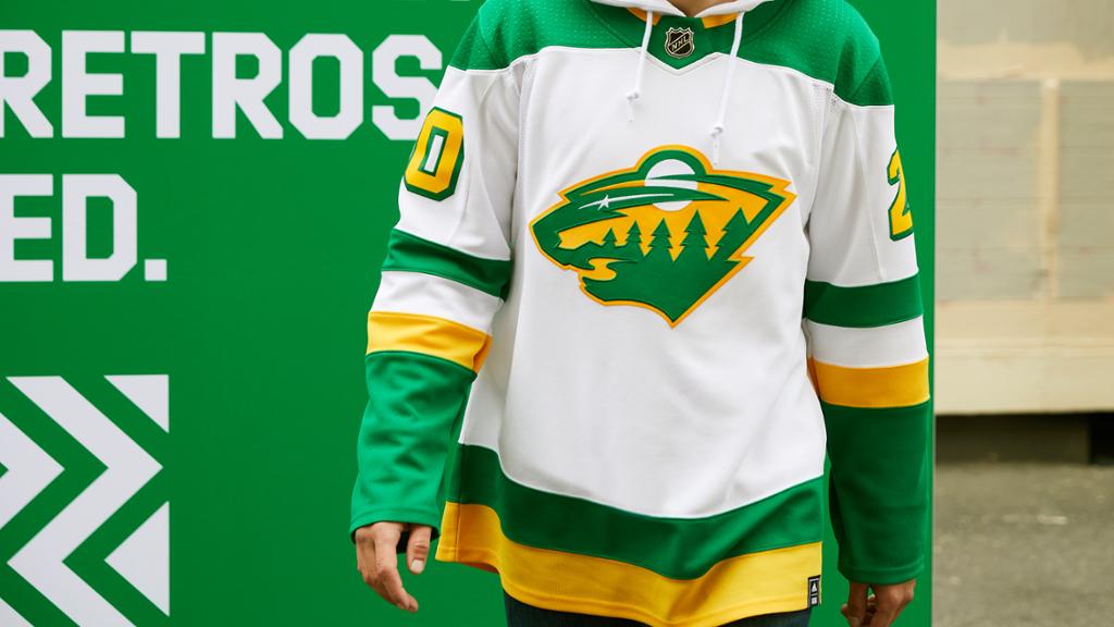
This jersey may look like it was branded by Subway, but that doesn’t detract from the fact that it actually is fresh. The Wild took the opposite approach to the Avalanche with this uniform, choosing to keep their primary logo while implementing the old North Stars’ colors, which, in this case, I think it really works.
-
Columbus Blue Jackets
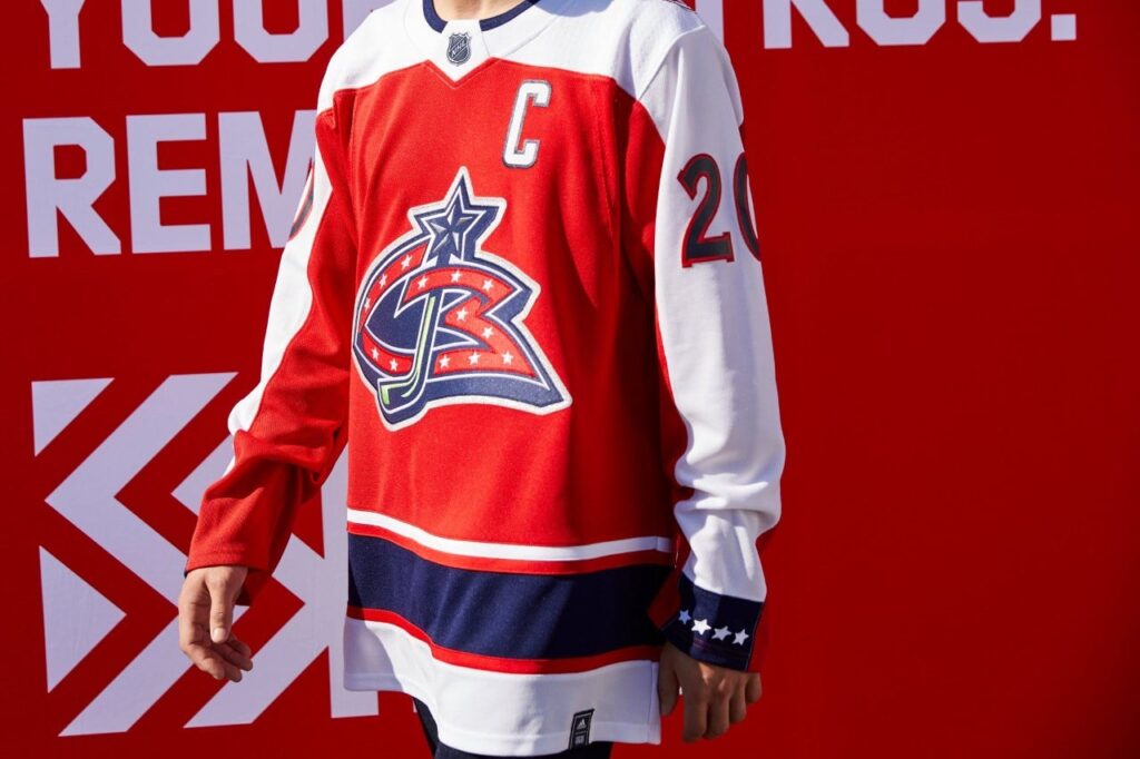
Here is an example of a jersey with side striping that actually manages to pull it off, unlike a few others on this list, the stripes actually fit the color scheme and design of the jersey, and they were excellently capped off with navy blue starred cuffs. Giving it almost the appearance of a military uniform, which clearly fits the Blue Jackets moniker.
-
Pittsburgh Penguins
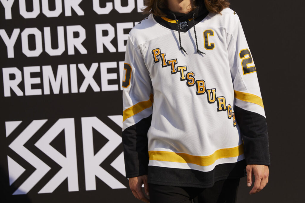
The Penguins remixed it back to the late 90’s with the release of a white version of the diagonal design, and I honestly don’t think they could’ve done it better. Bringing back the flair of the Lemieux-Jagr era Pens while the team is still in possession of yet another lethal duo will hopefully bring back some of that old-school magic as they look to see significant playoff success for the first time since their last cup run in 2017.
-
Washington Capitals
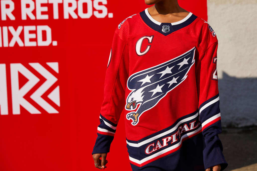
I have one word for these jerseys: Fuego. Not only did they execute a perfect reverse retro design, they also chose the perfect uniform to reverse. As the career of their franchise’s all time best player comes to a close, what better way to celebrate his legendary career on the ice than to don a design reminiscent of what he wore in his first few seasons in the league. This is not just some theory behind the choice that has no basis in reality either, as the team’s recent social media posts confirm this was at least a part of the intention.
-
Boston Bruins
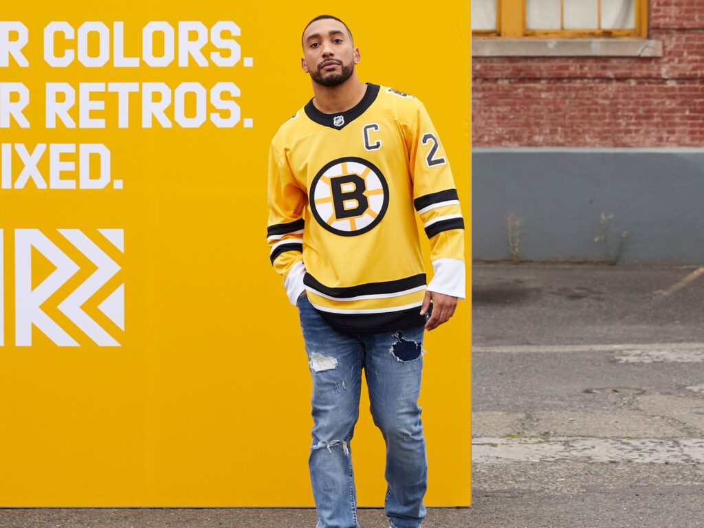
It’s very rare that a yellow jersey in this league actually looks good, take, for example the Predators’ current home jersey. But in this case, the Bruins design team did it to perfection. The striping, the logo, the shoulder patch, it doesn’t get much better than this with this particular color scheme.
-
Carolina Hurricanes
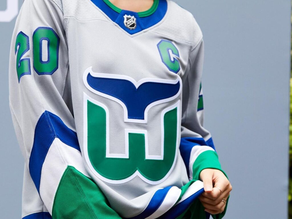
Are there improvements that could make this jersey slightly better? Yes. Could I rank a Whalers jersey any lower than the top five? No. Regardless of the small improvements I would like to see made, the grey base on a Whalers uniform is an incredible look, and something that would be in any fan’s top five from these retros.
-
Arizona Coyotes
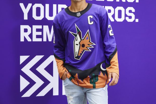
I quite honestly don’t think the Coyotes have ever made a bad jersey, and that tradition certainly didn’t end here. Purple is an incredible uniform color, and one that is rarely used in this league, so to see a primarily purple jersey, especially with elements of the Kachina logo upon it, put it way above most on this list.
-
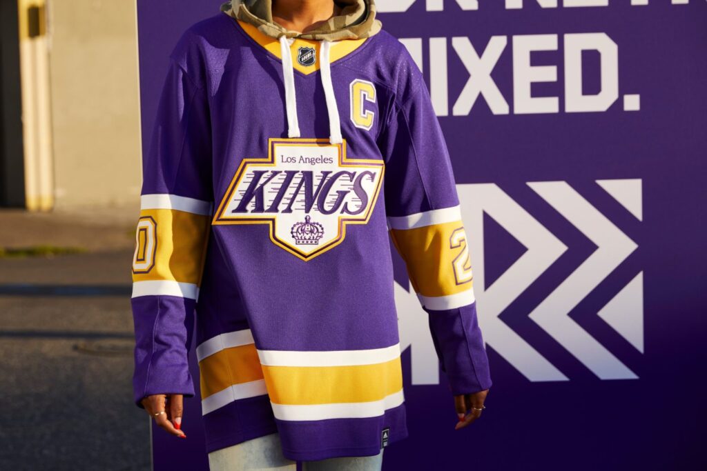
Los Angeles Kings
There could not be a better time for the Kings to bring back these jerseys, less than two months after the Lakers, (who conveniently sport the same colors) won their 17th championship in franchise history. Spectacular looking jerseys and well done to the Kings marketing team in advance for the bag they’re about to secure off of them.
-
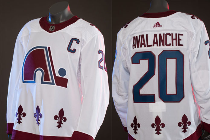
Colorado Avalanche
The fight to bring back the Nordiques in some form has been ongoing for more than a decade, so to finally see the logo once again on a jersey is fantastic, and for that alone, it secured a top two spot, but it isn’t perfect. I realize they’re going for the essentially an exact iteration of Quebec’s uniform, aside from the color scheme, but for the fact that they have changed the colors, I wish they would’ve also taken the initiative to change the fleur-de-lis at the bottom of the jersey, maybe placing them in between a second stripe or something of that sort. I understand the want to keep the historical design the same, but they just look sort of awkward to me, especially without the classic light blue and red.
-
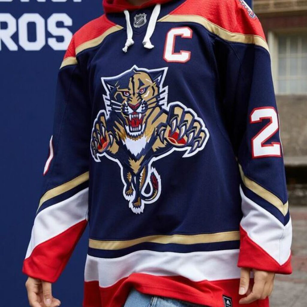
Florida Panthers
Utter perfection. The logo, the colors, the striping. In this series at least, no jersey is better than this. Easily one of my favorite uniforms of all time. The Panthers’ design team hit it out of the park with this one. It simply could not have been done better.
Images by: Tarps off Hockey/NHL


