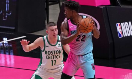
In this article, we decided to rank the NBA 2019-2020 NBA City Jerseys. Note that this is our opinion and you may not agree with all of our rankings.
*The Memphis Grizzlies do not have city jerseys for the 2019-20 NBA season.
29. Phoenix Suns (Los Suns)

Credit: Nike Inc.
This jersey barely edges out the Grizzlies jersey. The Grizzlies don’t have a City Jersey. This jersey is utterly hideous and the color scheme is horrendous. The ugly star design on the shorts is the essential reason why this jersey comes in last.
28. Oklahoma City Thunder (Memorial)

Credit: Nike Inc.
Coming in 28th place, this jersey blends the worst possible shades of brown and gray into the threads. Although this jersey is supposed to represent a memorial in Oklahoma City, it appears to look like a pool of mud.
27. San Antonio Spurs (Camo)

Credit: Nike Inc.
This year’s Spurs City Edition Jersey is a complete mess. Although it contains a camouflage background to commemorate the deeply Armed Forces populated city, the colors that go into this pattern make it look like a glitchy television. Remember the Alamo, but certainly not this jersey.
26. Orlando Magic (Citrus)

Credit: Nike Inc.
In last place for the Eastern Conference City Jerseys are the Orlando Magic’s citrus jersey. This jersey contains the same shade of brownish-gray as the Oklahoma City jersey does along with bright orange lettering. These two colors do not go well together at all and it appears the Magic were trying to represent too many things at once in this jersey between their steel theme park industry and their tropical citrus fields.
25. Portland Trailblazers (Rip City)

Credit: Nike Inc.
Although many are likely to disagree with this harsh ranking, this jersey is towards the bottom of the pack. This jersey does not show off anything about the city of Portland and looks like a 40+ Men’s YMCA League jersey. There are too many red and black stripes on this jersey, and the off-white background does not go along well with the sleek logo for the team.
24. Houston Rockets (H-Town)

Credit: Nike Inc.
At number 24, the Rockets jersey was also deserving of a bottom-tier ranking. Although this jersey was meant to represent the astronomical aspect of Houston, the font of the numbers look like the numbers on an alarm clock.
23. New York Knicks (Skyline Stripes)

Credit: Nike Inc.
Playing in New York, the Knicks have a lot to work with for their City Jersey. They chose the most basic attribute possible in their skyscrapers and they didn’t even show them off. The front and back of the jersey is a plain shade of navy, and the side stripes represent the skyscrapers. They had so much potential, but they blew their opportunity this year.
22. Washington Wizards (DC)

Credit: Nike Inc.
It is pretty much a given that the Wizards would incorporate the American Flag into their City Jersey, but they did not do it in a great way. Just like the Knicks, the Wizards did not show off their city’s attributes and placed it on the side. The front and back of this jersey is plain and looks like a blank piece of paper.
21. Golden State Warriors (The Town)

Credit: Nike Inc.
Just missing out on the top 20, the Warriors design for this year is just too basic. The jersey is simply black and white and contains an awkward tree design in the middle of it. The Warriors also had a lot of promise for their jersey design and they blew a valuable opportunity as well.
20. New Orleans Pelicans (NOLA)

Credit: Nike Inc.
When thinking of “The Big Easy”, Mardi Gras certainly comes to mind. That is exactly what the Pelicans decided to portray this year, but they did not do it too well. The colorful purple, green, and yellow stripes do not fully portray the festival and the white background makes it even duller.
19. Indiana Pacers (Racecar)

Credit: Nike Inc.
Like most of the white jerseys on this list, this jersey is sub-par. The navy finish line on the right of the jersey looks hideous and takes the eyes off of the cool number style of this jersey.
18. Detroit Pistons (Motor City)

Credit: Nike Inc.
Just like the other race car design, the Pistons jersey has potential, but a key trait ruined it. The jersey itself is slick, and truly represents a race car. The red and blue colors also go well together. However, the stripes do not continue onto the shorts and the shorts do not go with the top at all. Although this jersey is the best race car design on the list, it falls short of the top half of the list.
17. Philadelphia 76ers (Colonial)

Credit: Nike Inc.
The Sixers design for this year barely misses out on the top half of the rankings. This is because the jersey is too basic and is missing a key feature in the middle of it. This jersey is simply cursive writing, and the player’s number. It does not scream the history of the city, but only points it out based on its design.
16. Boston Celtics (Gaelic)

Credit: Nike Inc.
With a rich, and major Irish population, Boston was appropriately represented by this trait. Although the lettering is unique and encapsulates the Irish heritage, the jersey as a whole is too close to the normal Celtics jerseys which is why it just misses out on the top half.
Make sure to check out numbers 15-1 for the rankings.


